Mirage Buildings; obsession reflection
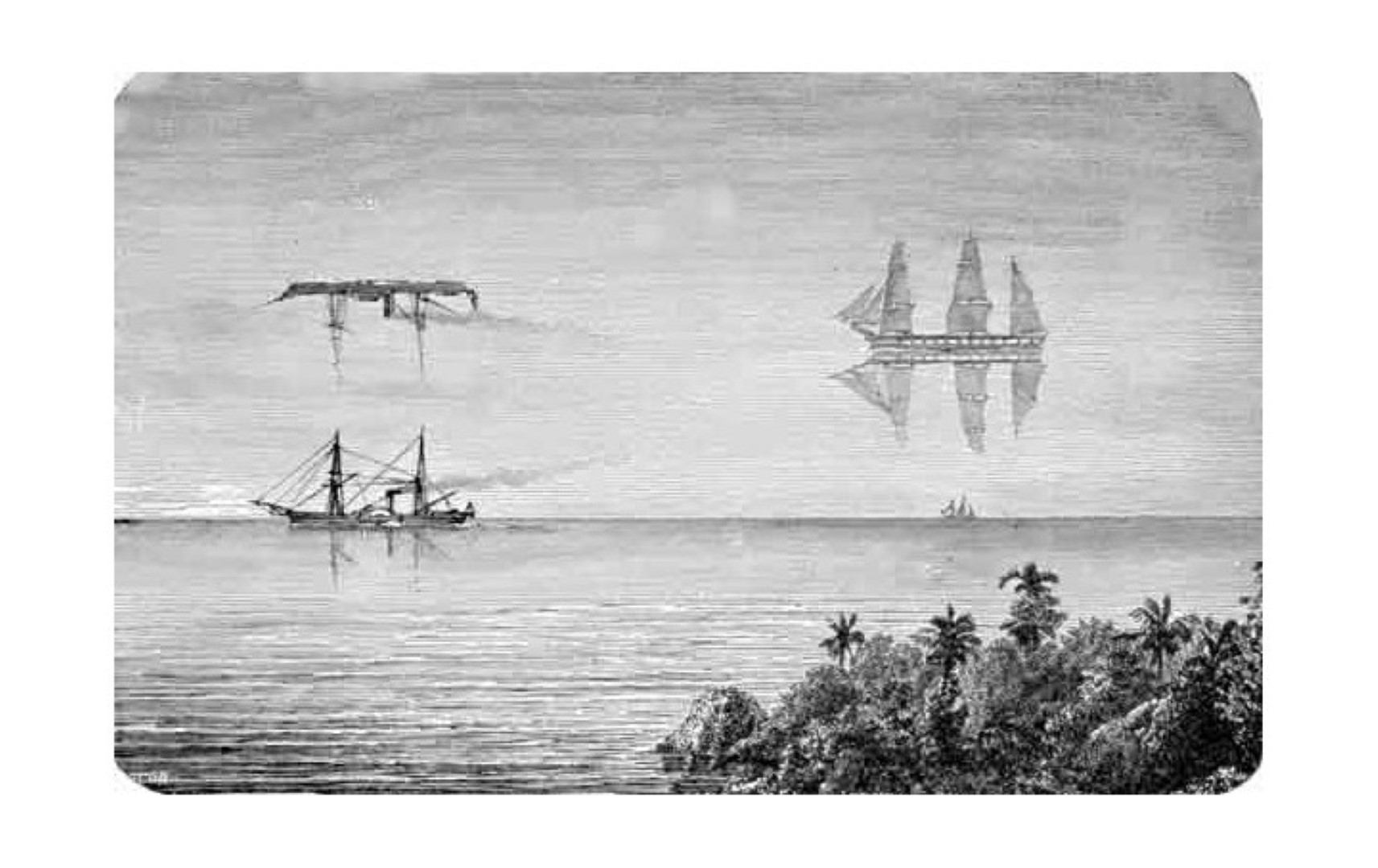
The Flying Dutchman is an ancient legend about a ghost ship, sporadically spotted by sailors, while being at sea for a long stretch. This ship could never arrive home and was doomed to sail the world-waters, forever.
It was seen in many different forms: stretched, fat, tiny, inverted, floating inside the waves, and even hovering above the water-surface, flying in the sky. It had a curious ever-changing appearance; sometimes, as it happens, duplicating multiple shapes at once. It can be very difficult to point out which parts of The Flying Dutchman are real, and what is science-fiction.
It all started in Barcelona
Today I will not talk more about Ghost Ships, but about Mirage Buildings, and just a little bit about art.
Okay, a little bit more about Art & Architecture.
Art & Architecture are nowadays viewed as two separate domains, but creative developments in Art & Architecture still have more in common than you might presume. Now there is a shared interest in the work of major players, in both scenes. Both are really interested in surface, particularly reflective surface.
To understand the Idea of Mirage Buildings (a term introduced in Eladio Dieste, and the curvature of brick), we will go back to the year 1928, to a Mediterranean place; Barcelona.
The architect Mies van der Rohe designed that year a revolutionary building, a piece of Art, for the coming 1929 Barcelona International Exposition. The building is well known among architects, and simply nicknamed: The Barcelona Pavilion.

A Gesamtkunstwerk composed of natural-stone-plates and a couple of cross-shaped-chromatic-columns. Planes and crosses, walls, and columns, together they support a thin-as-paper, white roof.
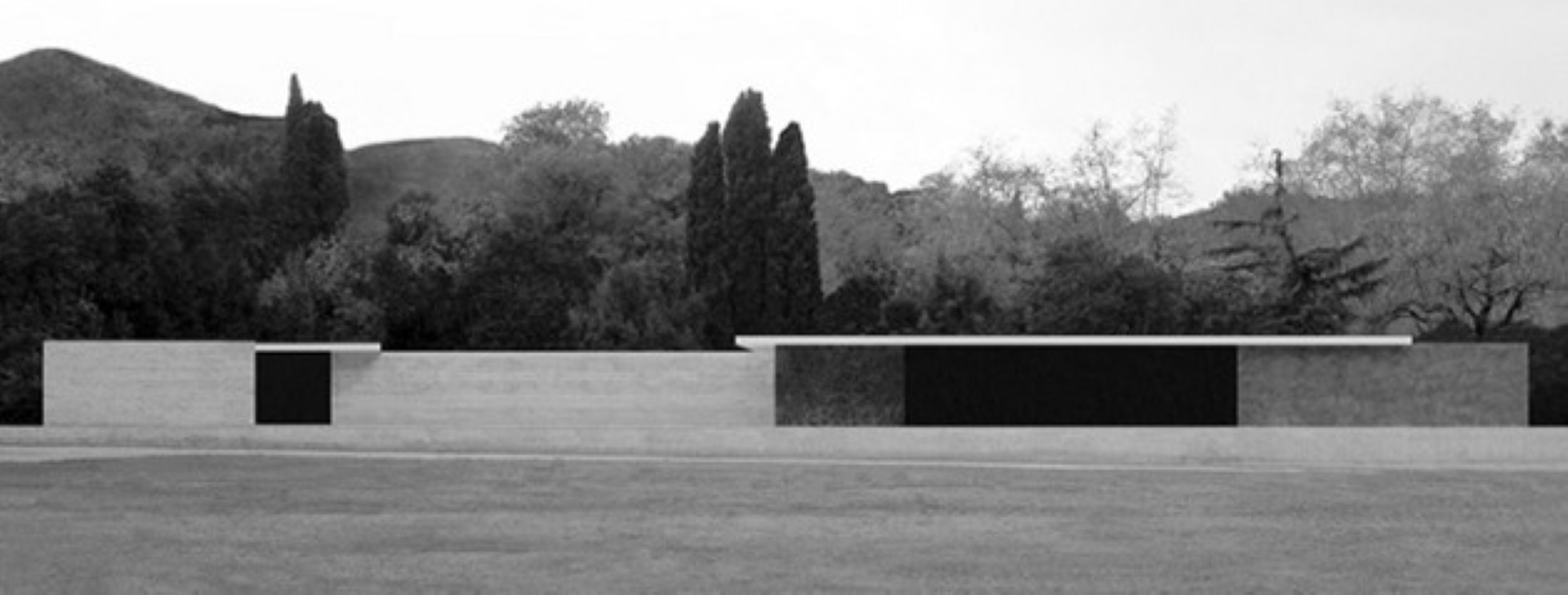
The building was planned as temporary construction, and therefore destroyed soon after the world-exhibition closing, in 1930. More than fifty years later, in 1983 to be precise, a group of Catalan architects decided to rebuild the pavilion. Mainly because of the building & the architect’s major reputation in modern-architecture-history, but also partly because of the sheer beauty of it all.
The Barcelona Pavilion is an open-box full of reflections; a work of poetry, from which the essence of its beauty can never be fully grasped.
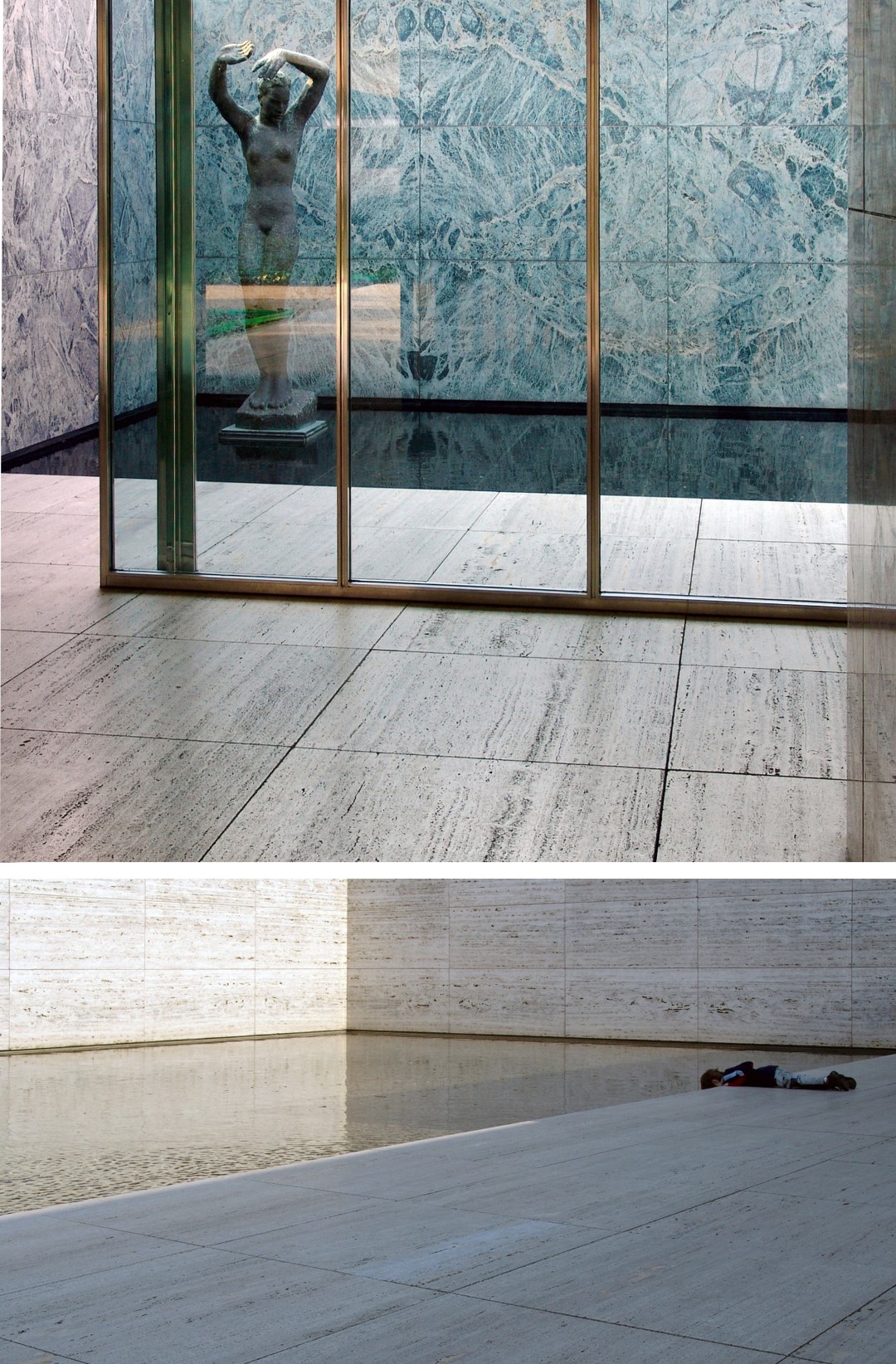
One of the inventive ideas Mies van der Rohe had for the pavilion, was his design for a cross-shaped-steel-column (seen behind the glass panels in the above picture), covered with a chrome-metallic-surface. The column corners are slightly curved, bending exterior reflections, appearing almost invisible when you move around it, a Mirage.
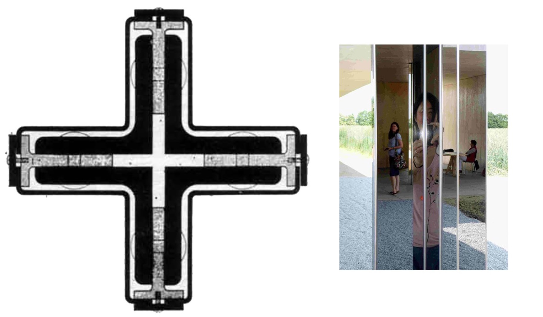
Mies van der Rohe used this type of glossy columns more often, but only in his smaller projects; for example in the beautiful Villa Tugendhat (1930, Brno), or in his Krefeld Golf-clubhouse (1930, project not realized, in 2013 a 1 to 1 scale interpretation model was built by Robbrecht en Daem).
The bigger works by Mies van der Rohe, designed in the later period of his life, like the Neue Nationalgalerie (1969) in Berlin, are conceived in bare-matte-steel-structures with glass infills.
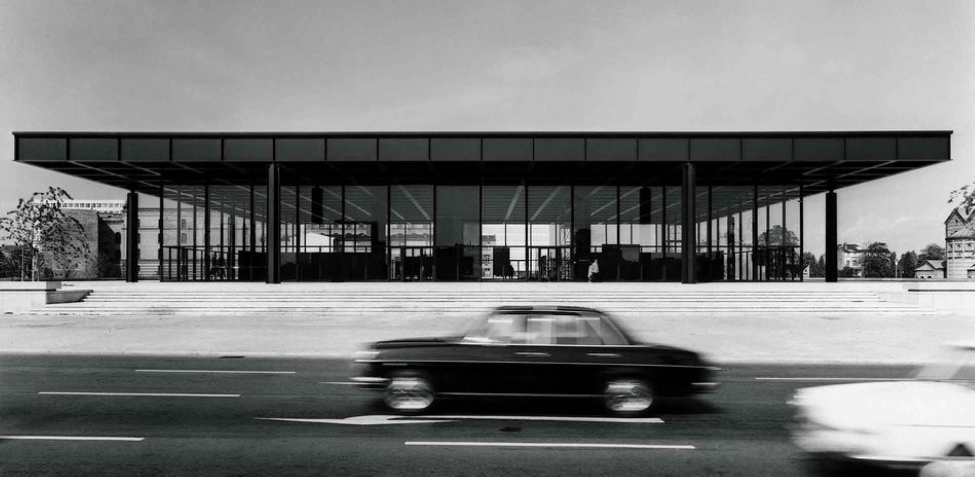
A flying smudge {Intermission}
To understand a bit more about the ideas behind-bending-reflections, we must go further back in history, to 1533. This year the artist Hans Holbein the Younger painted the Two Ambassadors: Jean de Dinteville (French ambassador in the major city of London) and Georges de Selve (Bishop of the small commune in Lavaur, Tarn, France).
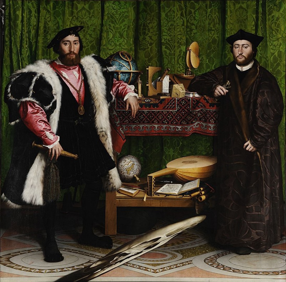
Two serious looking guys posing next to a table full of excitingly-curious-instruments. Few of these instruments I had never seen before.
For centuries people study the symbolic meaning of these instruments, but also the patterns on the cloth, the floor, the curtains, and the composition in a whole. “The Ambassadors” is a work full-of-symbolical-meaning. Hundreds of books, thousands of pages have been written about this single piece of Art.
*If you would like to know more about this painting and Hans Holbein the Younger, you can take a visit to your local Library, for sure you will find something interesting there.
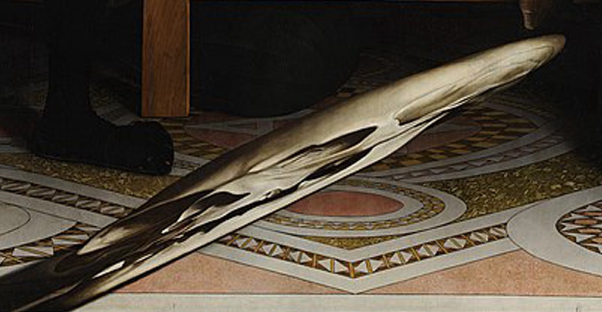
Anyway, I will not write more about the instruments, nor the patterns. I will just focus on the huge smudge, top-down, right at the centre. Yes, that thing is part of the painting, it is not a photoshop-bomb or an error in the image. As a matter of fact, it’s a very sophisticated optical trick, technically called: Anamorphosis: Distorted projection or perspective. It requires the viewer to occupy a specific vantage point, use special devices, or both, to view a recognizable image.
When you look at the painting in real-life, there is a certain angle in which you can see the smudge clearly shaped. You might have a feeling of what it is, or maybe you didn’t, like my wife. She thought it might be a woman.
Well, in real-life, viewed at the right angle, the smudge is something else. It’s a human skull.
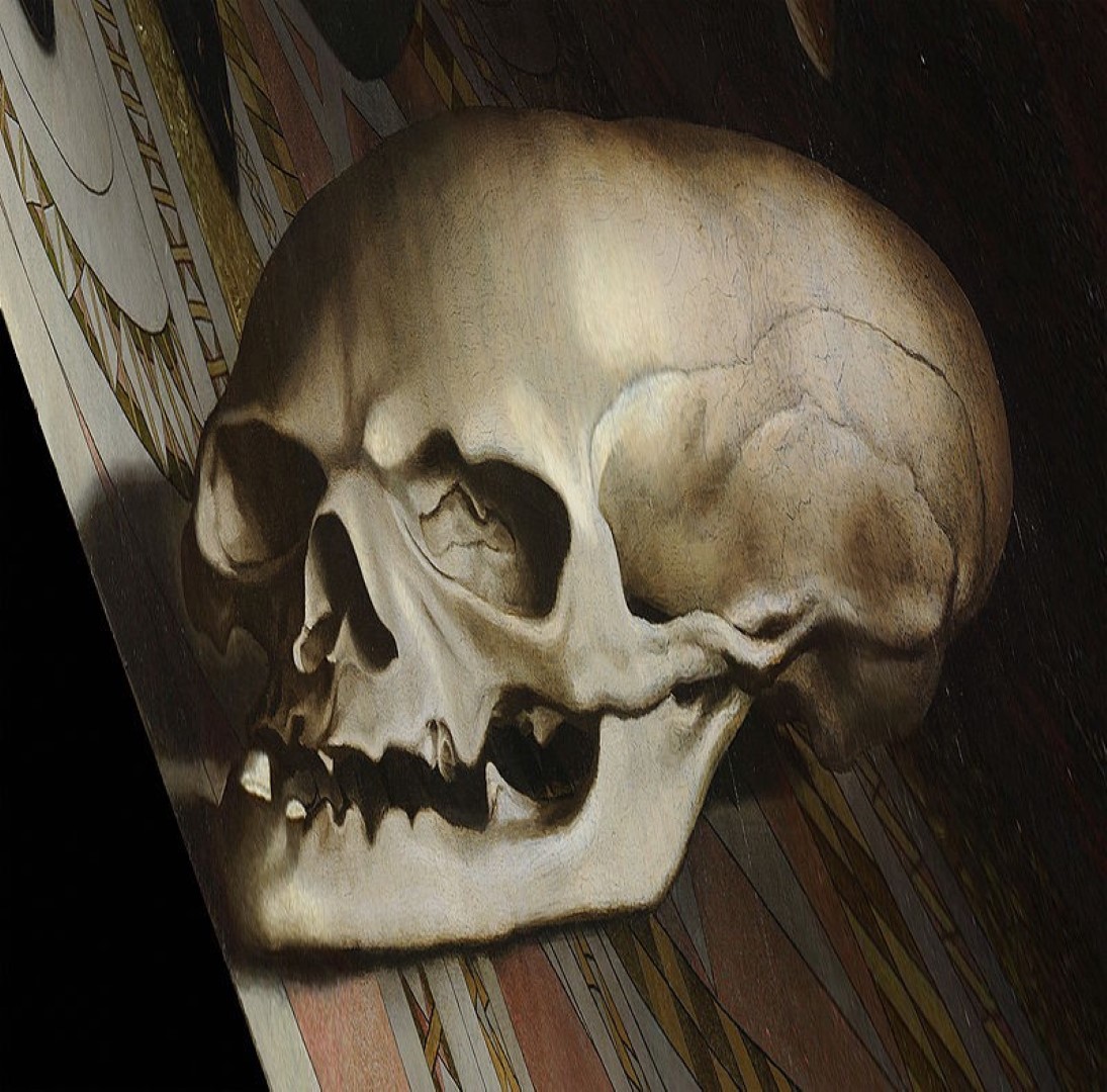
This technique of distorted projections is till today used in all kinds of media: drawing, painting, sculpture, installations, toys, special effects in films, and also architecture.
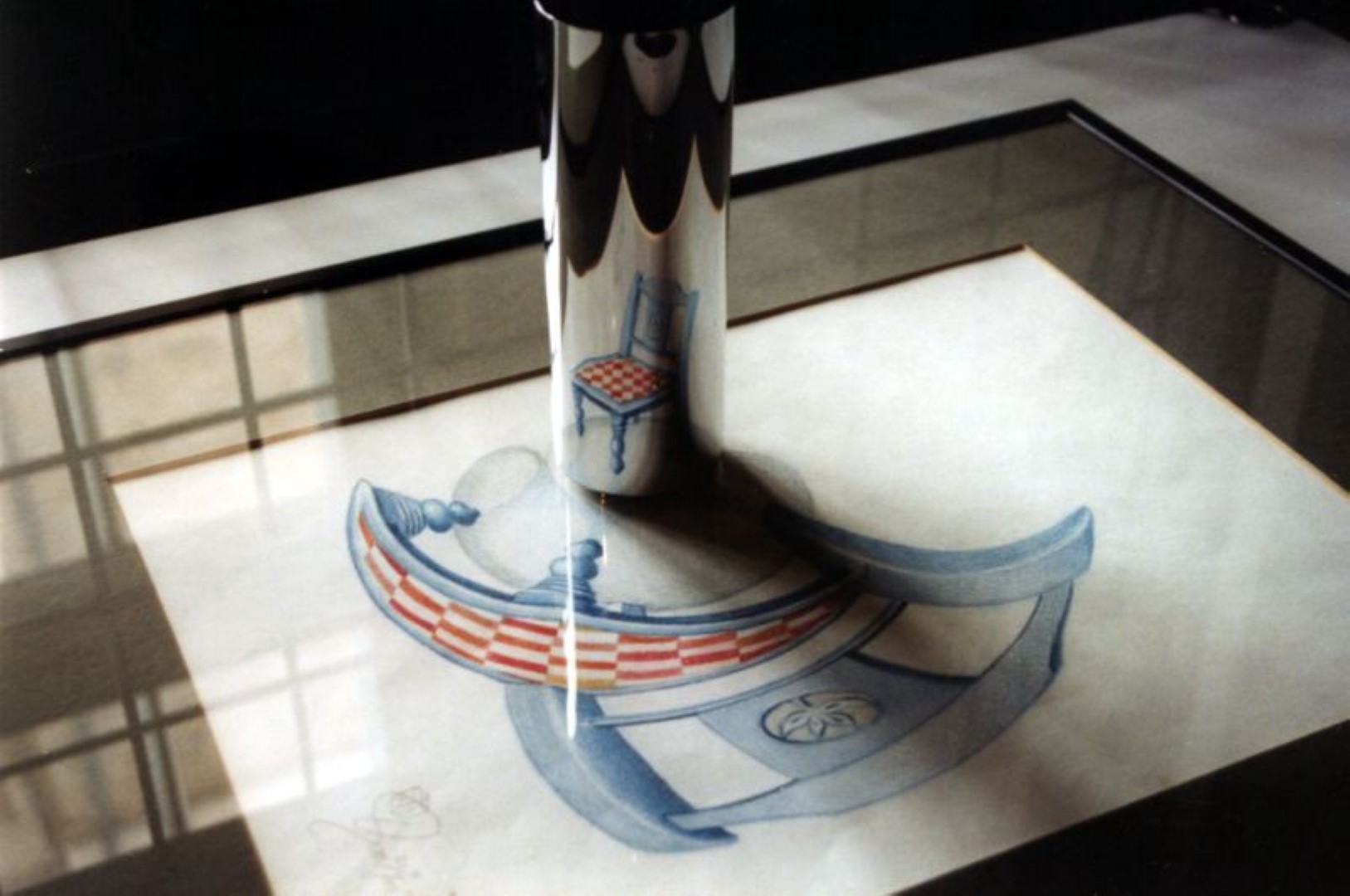
Every time I see an amorphous-object in the media, as an art-piece or in the shape of a Mirage Building, it’s presented to the world as something fresh, something truly contemporary.
But wait a minute there…Holbein was already doing this in 1553, with his Two Ambassadors: without even displaying the anamorphic instrument itself.
Presumably Holbein was also not the first, it started much, much earlier, at the start of humanity {researchers’ hypothesis}. Prehistoric men were already drawing variations of distorted projected animals in their concave caves, millennia ago.
Reflecting a Rabbit on a Pringle
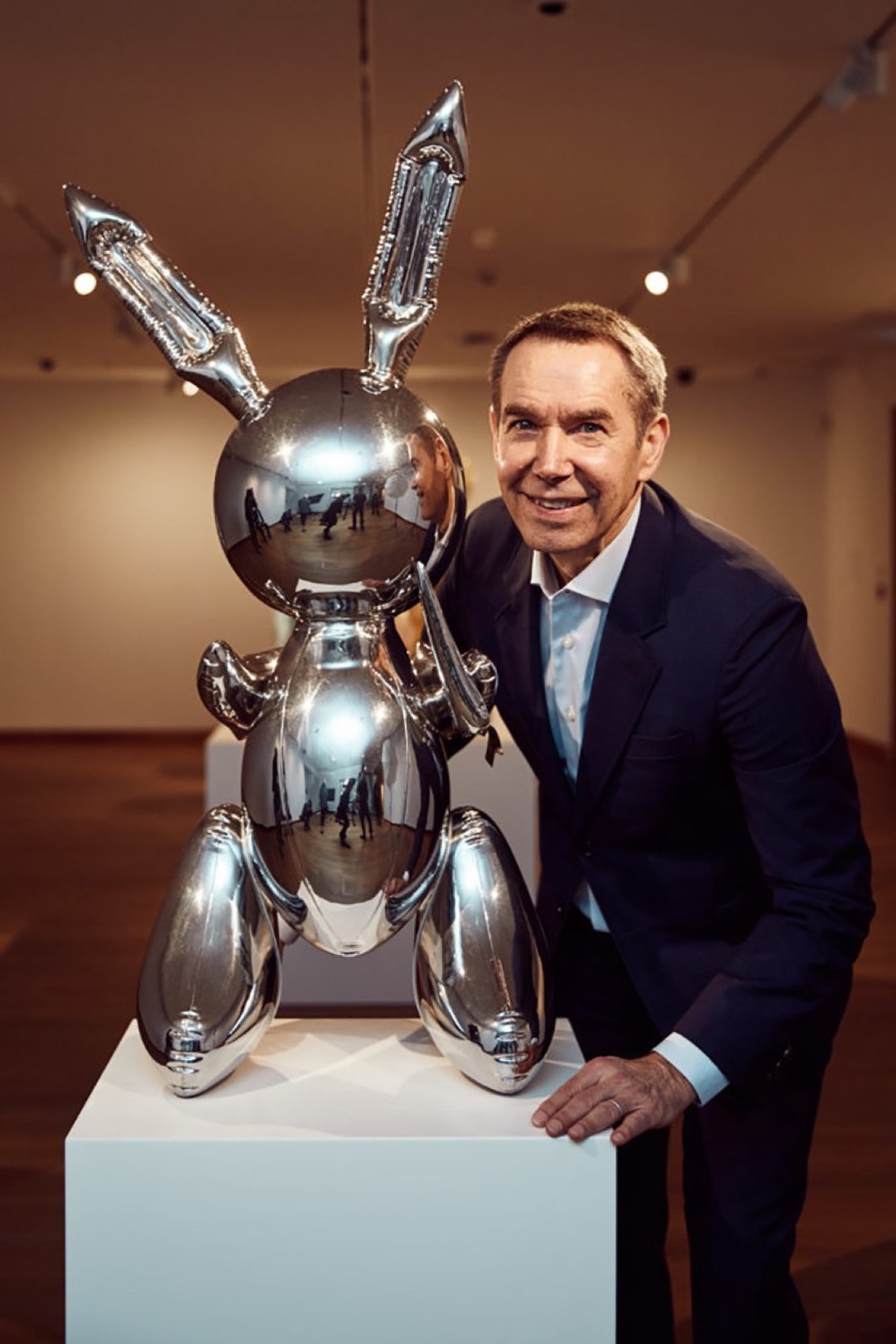
Maybe you know this guy, or at least his major work. For sure you saw his shiny-balloon-dogs, somewhere on a website or a magazine at the hairdresser?
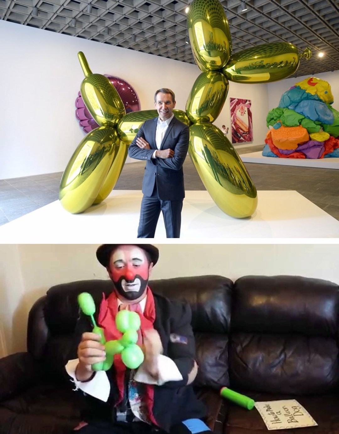
The balloon-dogs of Jeff have the same shape as the balloon-dogs a circus clown makes-and-gives away for free, to children. Jeff is unfortunately no philanthropist clown; he sells his balloon-dogs for top dollar, to collectors all around the world.
However, before the balloon-dogs, Jeff was worried to death. He had restless nights, couldn’t sleep well for years, because there was nobody in the world able to technically produce his giant balloon-dogs. Until one special day, …
These balloon-dogs are not made-up by ordinary balloons. They are, believe it or not, constructed out of an ultra-thin-metallic-surfaces. Jeff’s balloon-dogs don’t have that matte-surface as the original dog, instead they are very, very shiny. But still, they easily catch dust. Dusting those dogs from time to time is advised, to keep the optimal look.
The big dogs nowadays go for 50+ Million USD at international auctions, and his shiny rabbit was last spring sold for a whopping 91+ Mil. (91.000.000) USD. The smaller dogs, well…, you don’t see them so often anymore, circus-life is a starving profession you know.
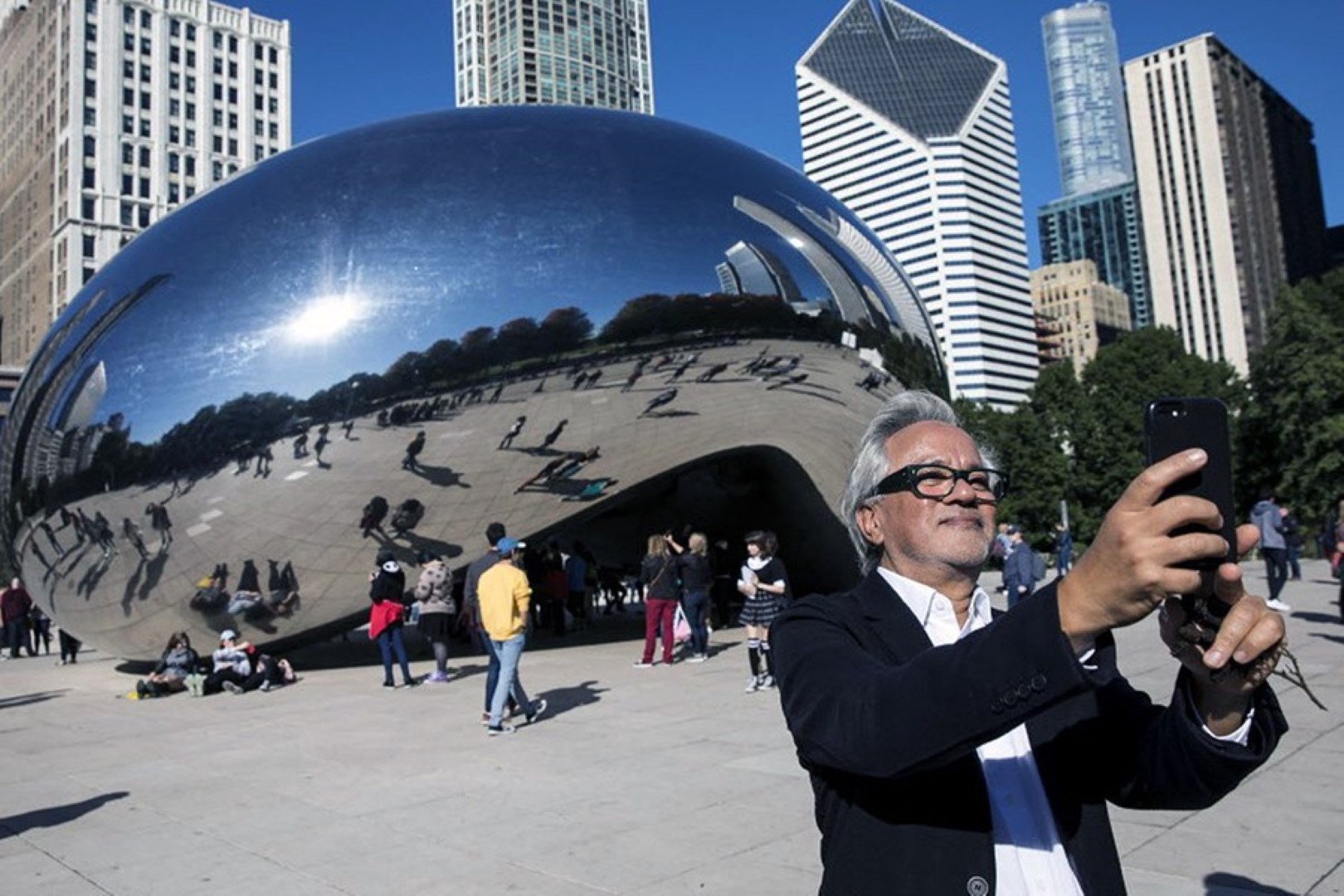
Jeff is not the only artist mesmerized by reflective surfaces, his companion Anish likes them also very, very much, but he prefers the more abstract variant. Amish …pardon, Anish’s shows are full of reflective surfaces.
Like the exhibition shown in the picture below. In the centre of the stage we can spot a giant, double-curved-circular-surface, a reflective Pringle. This giant Pringle is not edible, but for sure you can buy it, for the best offer that is.
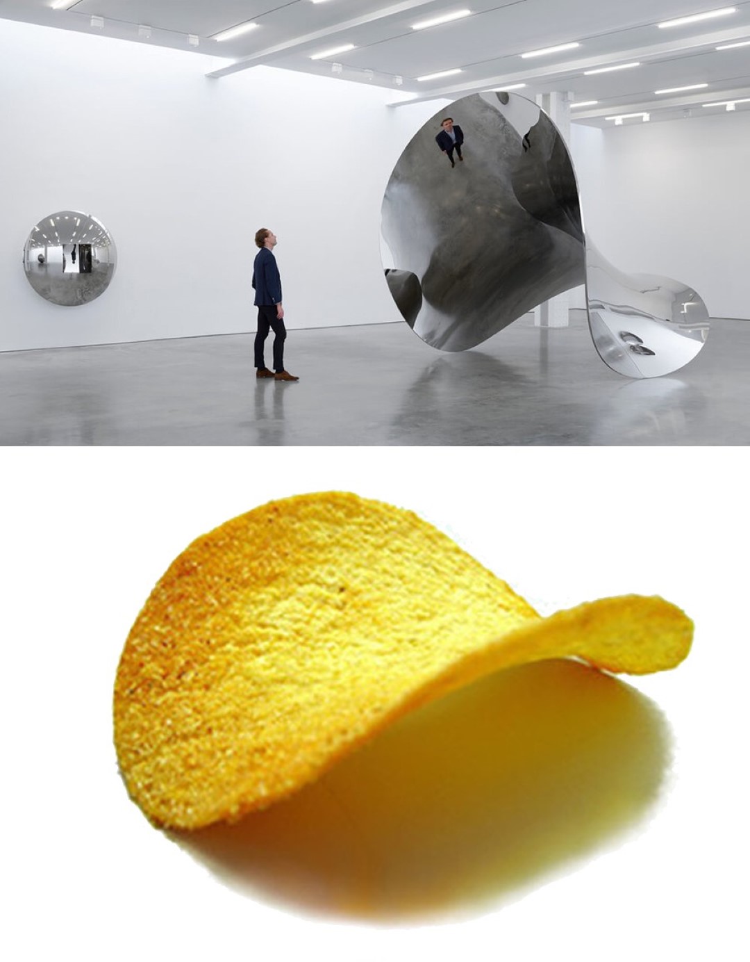
(Above) {Gloss} Someone looking at his own reflection in the Silver Pringle, by Anish Kapoor; Image courtesy of Lisson Gallery © (Down) {Matte} Golden Pringle, courtesy of the creators of Pringles©
I remember…, back in the days, when I was a kid. I've already seen these kinds of curved-mirror-installations.
We went into rides, a spin in the wheel, and then at the end of the day a visit to the Hall of Mirrors. A great place to make selfies, unfortunately nobody had a mobile phone those days. Nowadays Halls of Mirrors are not so easy to find, cause funfair-life is a starving profession.
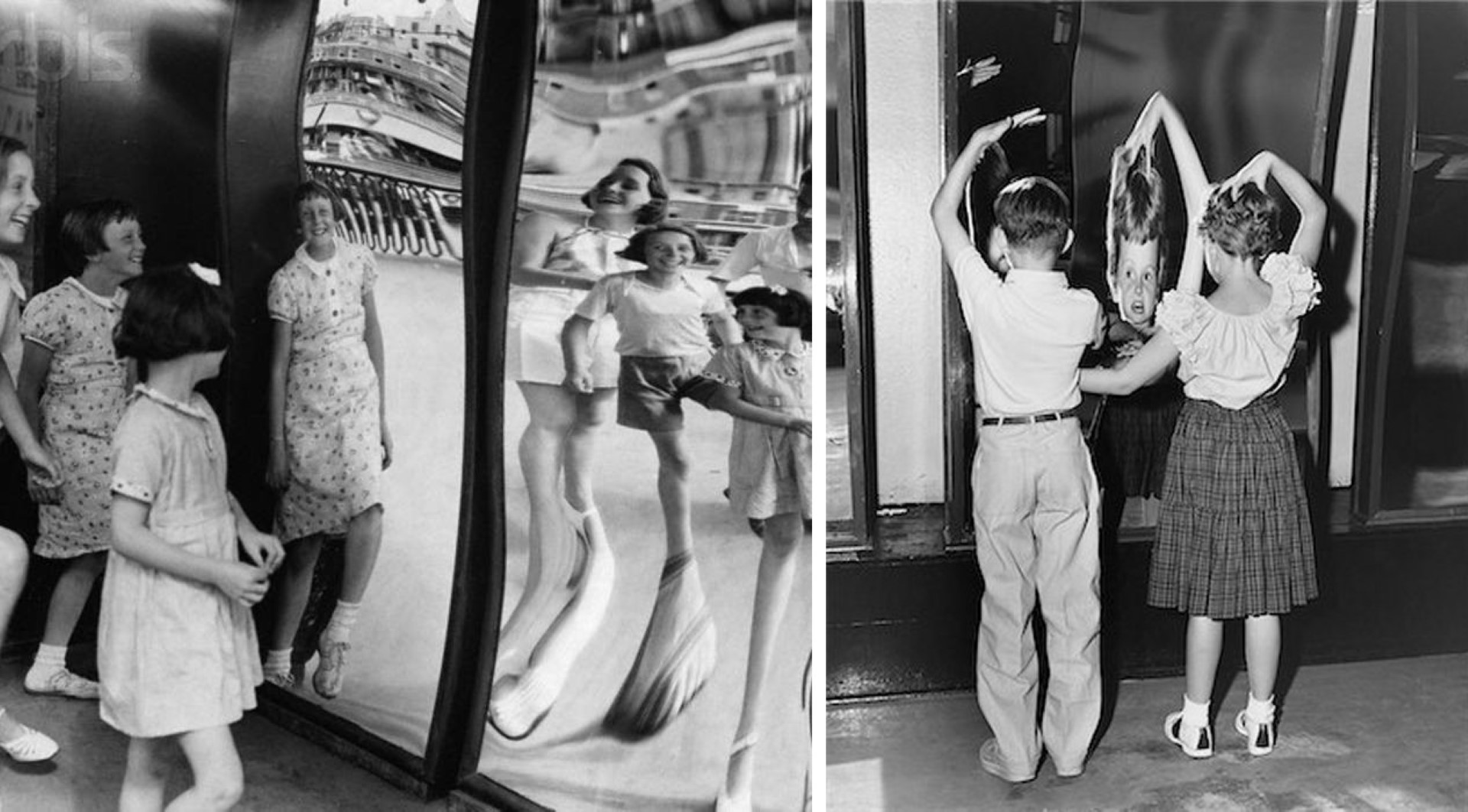
Entertainment for the Bourgeoisie, fancy folks would call these places. In that sense nothing has changed, except for one minor thing: the rich and famous sneakily joined in as well.
Do you know? Another very successful artist creates slides. The ones you find at the playground, but much, much bigger, with more turns. He places his slides in major museums around the world or sells them for millions to collectors. Amusing story. His work is praised for being so sophisticated, and fun at the same time.
Still waiting to see the first Aquapark-slide inside a museum, though. Sliding through the water, while viewing the major works of Picasso, amazing.
Maybe another day I will tell you more about these adult slides, …
Or maybe not…
Naaah…
Enough already about these funny-mirror-installations, I still must tell you about Mirage Buildings.
Latte with Jacques
In Switzerland, New York, and many other places, there is a regulation considering the construction of large-scale-building-projects. At least a small percentage of the building costs (usually not more than 1%) should be used for a public-art-project.
When architects design their proposals for large-scale-building-project’s, (measuring 1000s of square meters), they often forget about this 1% rule; cause it’s not so important in the design-process, I heard.
But to present the project to a city council, the Architect {Visualizer} almost always must make an artistic impression of the building.
Here, at the end of the process, the 1% kicks in. From a Library (full of a famous-recognizable-art-pieces), the visualizer picks an object, and drops it on the ground-floor, preferably next to the entrance. Thus, so suggesting the incorporation of Art in Architecture, a special effect inside the visualization.
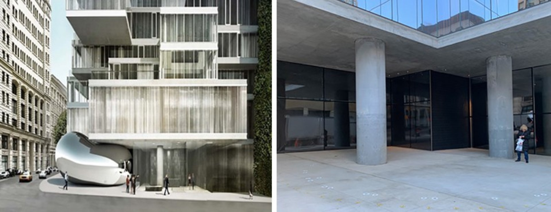
This project for a luxury-housing-skyscraper-with-million-dollar-apartments-for-the-rich-&-famous, also shows a big-known, but architecturally-preferred-abstract object on the ground floor. Not surprisingly, by Anish Kapoor. I will not state that, this piece at the corner of a high-rise, is Anish’s famous reflective-Chicago-blob, downsized, stretched and placed under the corner of a building in New York.
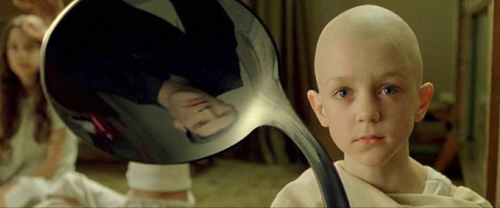
Cause…, maybe the story was different this time. I can imagine Jacques dreaming away in his reflection of his spoon, while reviewing the project-papers.
Pierre: Hey, you come for a coffee? I just received a message from Anish, he is in town this afternoon.
SNAP! {Jacques woke up from his daydream and came up with a solution for the 1-percent.}
Jacques: Yes, be right there!
Jacques draws the outline of a roundish form in the building-papers, all the way in the top-down corner, at the start of the high-rise. He then writes with big bold letters 1% Rule! He takes his coat and leaves the office.
Espresso with Winny {Omero}
In the Netherlands they love to drink coffee, a lot of coffee, but the best coffee is still made in Italy, that’s a fact. And not expensive either; espresso for 1€, served at a small local bar. The busy people in the Netherlands drink even more coffee at times of crisis. Before the deadline of a prestigious architecture competition for a publicly-accessible-archive of a museum in Rotterdam, gallons of coffee are drunk.

Short-story about the design-process for this publicly-accessible (for the price of 15 Italian coffees)-museum-archive, based on numerous true stories
Omero, while working paranoid-night-shifts, building models at the office; places his espresso-cup straight in the centre of the site-model.
Che cazzo…Dobbiamo fare qualcosa…
{from unknown origin}, not understanding Italian, looks at it for a few seconds and grabs some small-model-maker-trees. He throws the trees inside the half-full cup of coffee.
Omero: Hee! What the f. man, my coffee!
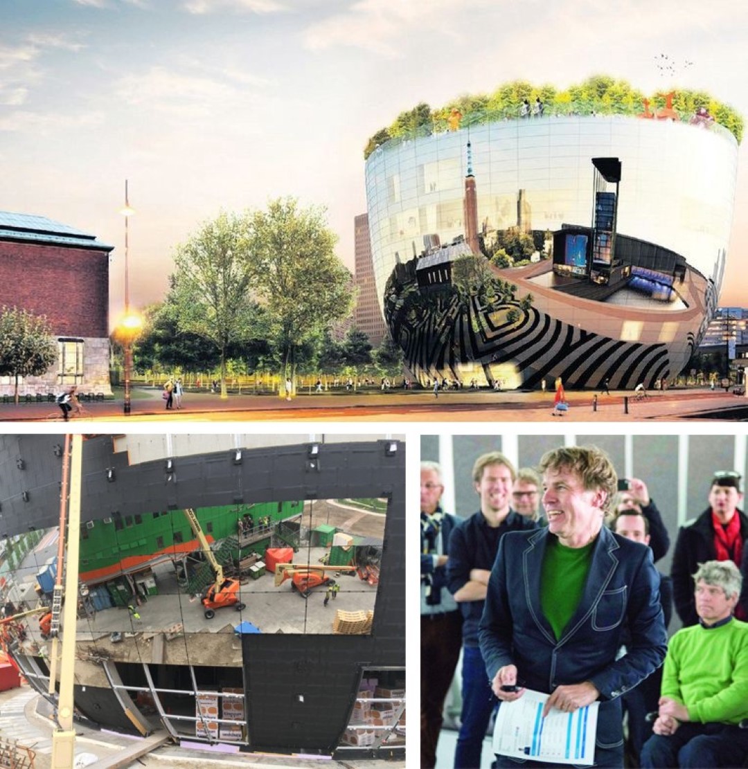
What about this, we present something like this tomorrow. We just rebuild it in styrofoam, some sculptures on top (while holding some miniature-people-for-architecture-models in his hand), same shape. In real-life it could be clad with tiny Islamic mosaic tiles, so we achieve the double bend curvature, without curving its internal surface parts.
The mosaic-grid will only be visible from a very short-distance. By the way, we can improve the Museumpark, with new trees. The park is there already anyway, and easily accessible for the public, for everybody, not only museum visitors.
Omero: Interesting, interesting…but not enough Versace man…You know that they won’t accept that kind of architecture here, it’s too modest. It should have something more, something eye-catching, Big, you know what I mean, right? So visitors will spend money to enter.
[Omero plays with the silvery spoon in his mouth, twisting it, turning it, till suddenly… It drops on the floor.]
BLING!
Omero bends down to grab the spoon and {unconsciously} sees his own reflection in the small-round-reflective-surface of the silvery spoon. Then he drops the idea:
What about this: A giant-reflective-espresso, like this Kapoor guy, you know, Chicago, this giant blob, we just make a Cup. A Cup-for-Art
Homecoming…Yes, let’s do that! I’ll cut and sandpaper the Styro, then we’ll wrap some aluminum-foil around it. You make the trees, Ok?
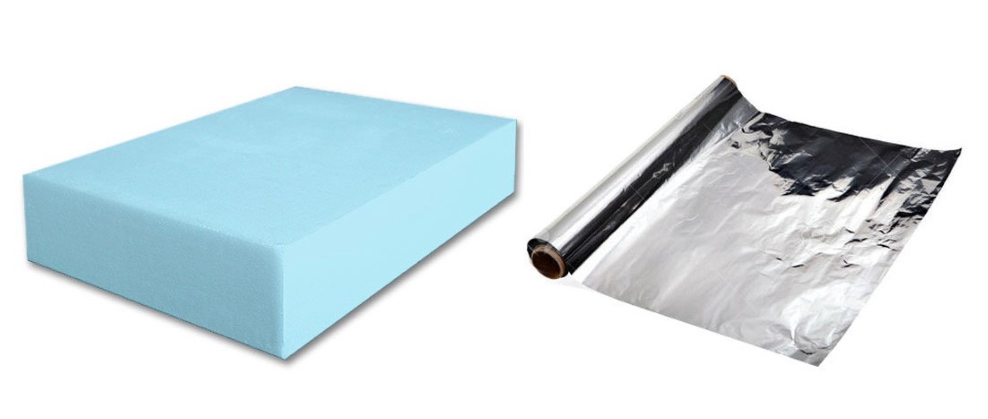
(sandpapering the cup): Hee Omer! We can make a coffee-bar on top, in the private-garden, to attract visitors, so they buy a ticket to enter!
Omero: Sì, sì, ho capito, but let’s finish this model quickly, so we can go home before 00:00 tonight. Finally get some sleep.
[Next morning at the office]
W (Partner of the architecture firm), while sipping his espresso, listens to the two guys presenting their plan and starts to laugh, almost spitting out his coffee.He then answers dead-serious: It’s an interesting approach, continue with this one.
A couple of months later it’s announced: They won! Rotterdam finally won the Cup, again after so many years!
Psst..[don’t tell around, OK?] Sometimes you just need to drink coffee with the right people, in the right places and you can bend the spoon; overrule-the-rules for a competition. It makes it a bit easier to win.
The office was initially disqualified, because Sjarel Ex (the director of Museum Boijmans Van Beuningen) had discussed the building with Winy Maas during a coffee appointment. —04.02.2014, Versbeton.nl
Swiss Chalet {Sahara Tent}
So, there we are, at the end of the trajectory. From the Idea of Mirage in Art & Architecture, a visit to the Hall of Mirrors, passing by some giant-balloon-dogs, a reflective-Pringle and arriving at an Espresso-Cup, filled with the best Art-pieces.
But did we really see the end of the Mirage?
There is one more explicit (and one implicit) example. This time not an architecture firm designing a building as a reflective-art-installation, but an artist who figured out he could turn the process around; he built an art-installation as a building.
Some months ago, a Swiss architect, all dressed in white, mentioned this building to me; a design for a chalet in Gstaad, by the American artist Doug. It is almost like a typical Chalet, but not exactly, it is all reflective, inside-out.
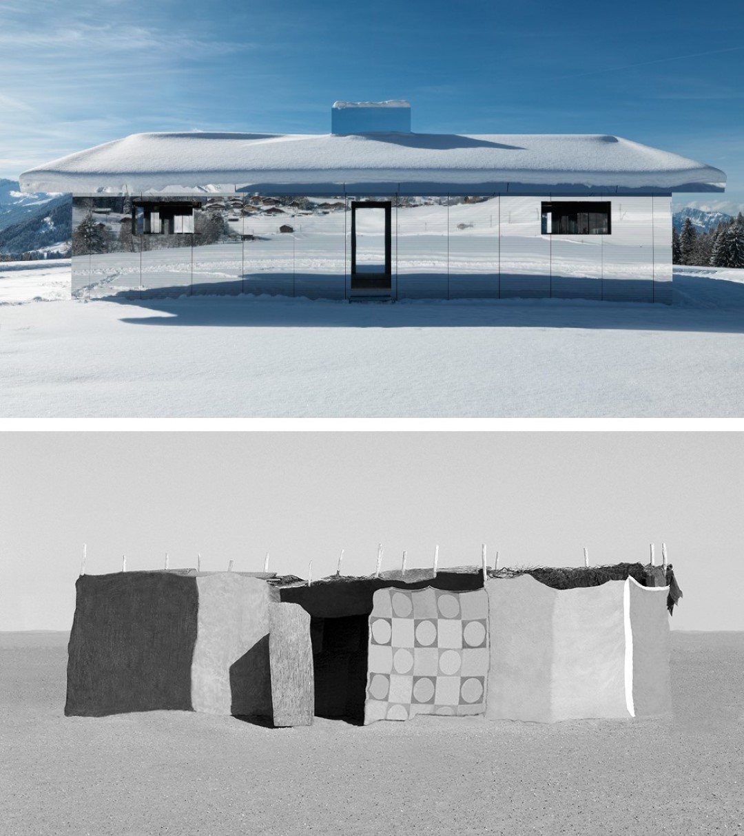
While writing this essay I searched for a good photo and came across a frontal view, which explains it all. It reminded me of Erasing-Non-Places, a series of, a great many, edited photos of architecture I made all around Europe and other parts of the world. All faced frontal, but none reflecting.
Walkie Talkie {The Burner}
Around five years ago, a newly erected building in London made the headlines of the news. Not because of the design, which was described as bulky, fat, and plain ugly, but because of a special-optical-feature it had. This building was so reflective that on sunny days, you could barely look at it. That’s not the end of the story.
Did you ever try to burn wood with a magnifying glass when you were a kid? Exciting,right?! Waiting for an hour till you finally managed to get the right sunray angle and burn a very small piece of dry wood.
For sure Rafael, the always smiling Uruguayan architect, was excited too. He was so excited, that, when he had become a well-known architect, he {unconsciously} scaled the idea of a magnifying glass and incorporated it into the design of a corporate building.
Rafael proposed the design to the council of London. It had a slightly curved surface, all glass, all reflective. Constructing the building was not so cheap, partly because of this eccentric shape, so along the design-process some changes had to be made. For example, a decision to leave out the exterior-window-blind-system. Not such a big deal, there are other ways to cool the interior of a building, like high energy consuming AC-Systems.
Rafael knew, at this point, without exterior window blinds, the curvature of the all-glass-surface could also cause some reflection problems for the surroundings, but thought: “Hee, this is London, not Uruguay. It’s always raining when I visit London.”
But, with the changing weather{climate-crisis}, hot sunny-summer-days occur more often than before, also in London.
While finalizing the glass facade, the news reached him. His building melted expensive cars parked in the neighboring streets. After hearing the news, Rafael plainly answered to all the commotion: “I didn’t realize it was going to be so hot”. When I first came to London years ago, it wasn’t like this … Now you have all these sunny days.”
The Death-Ray-Walkie-Talkie, Darth Vader would have been proud of him.
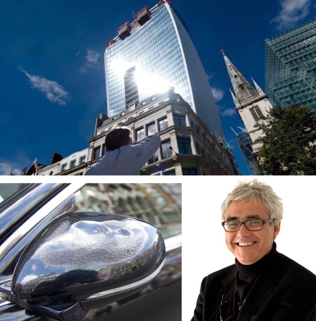
Luckily, the problem can be easily fixed with a thin film, covering the glass surface. And well, glass easily takes up dirt, dirt doesn’t reflect. When you leave the glass a bit dirty, your problems are solved automatically, without spending a dime.
Advice from an old wise man
We passed the complete circle to describe the Idea of Mirage Buildings, crossing domains of Art, Architecture & Science. It was long, but nevertheless an important journey, seeing that Mirage Buildings are all around us these days. Most of them are not so shiny & literal as the examples in this essay; these buildings go disguised in a well-dressed suit, or as something else than a building.
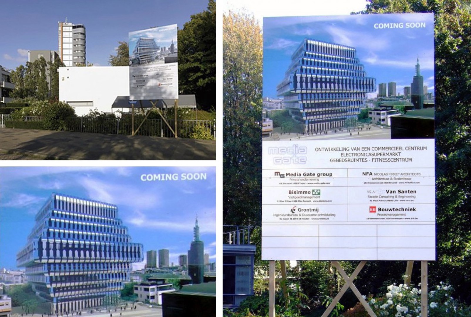
What they all have in common is an obsession for the plain, plain surface. Surface above content, above usage, above ergonomics, above inherited material qualities…and far above poetry.
An old wise man told me once: {In the western world}, an artist {architect} is a representative of his times. He ought to show the times as they really are; as a sort of social critic, by making the world look grisly, to make it as ugly as he can possibly manage.
The ingenuity about it is endless, because that’s the time. He {or she} is a critic. [the old wise man paused] {he lowered his voice}
…Instead of being somebody who reveals, someone who brings you an invitation to dance. The Ambassador who creates timeless beauty.
Mirage Buildings; obsession reflection. All notes are linked in {integrated}. M. Production © 11.2019 Triple-A Society