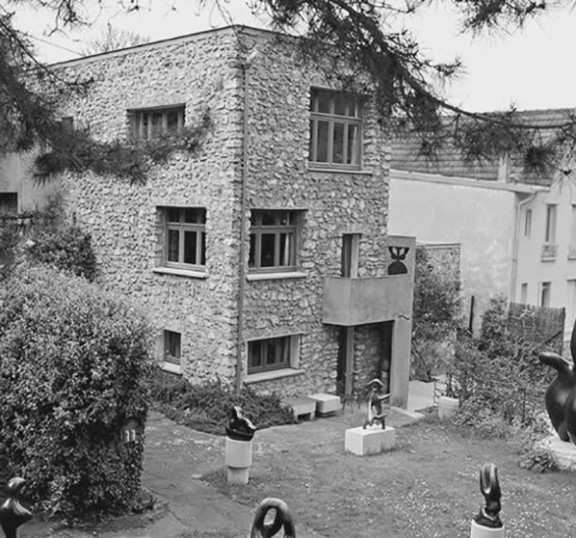
Van Doesburg House; Spiritual use of color in Architecture
This Essay is an excerpt of the investigation I made during my stay at the Van Doesburg House in 2018, Meudon (Paris), coined as Abstract : Reality [Language].
The bell rang, I jumped up and walked to the door. I looked outside, down through the small, squared window of the blue door.
Who is it?
An older Dutch man presented himself at the gate of the Van Doesburg House. I opened the door, down the stairs, through the gate. He asked if he could come in; to see the house close-up. He was here two times before, but was not able to manage to get in. Although the house was closed for visitors that day.
I said: Sure, no problem.
He called his wife, who was still sitting in the car.
“Are you coming, we can go in!”
He presented himself as an architect-professor-of-product-development at Delft University, particularly interested in Space Structures. When we walked through the house he pointed at the gray bare concrete table.
M.: Architect X., a friend of mine, also resided in this house some time ago. He sat at this table.
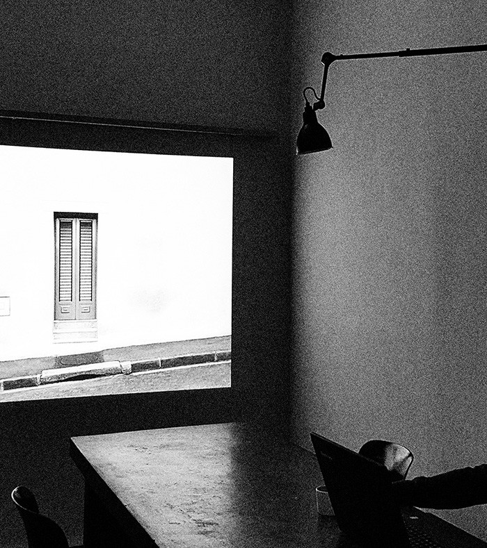
H.: I told him that it was not so comfortable, this altar.
It’s not really made for sitting I guess, also not for working. But you can put something nice on it like a prism, it really works well for product-placement.
Beautiful trees outside. The woman said.
Yes, there is a lot of light coming through the Stained-less-Glass windows these days.
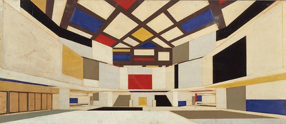
Maison d’Artiste — Van Eesteren & Van Doesburg
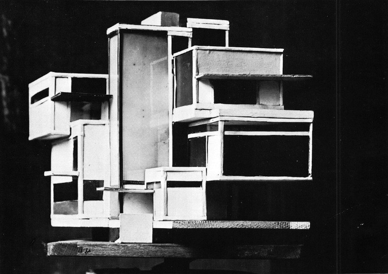
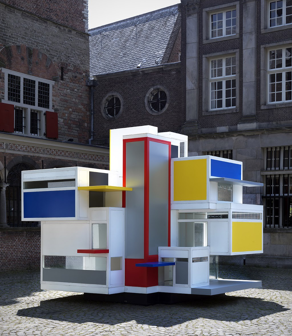
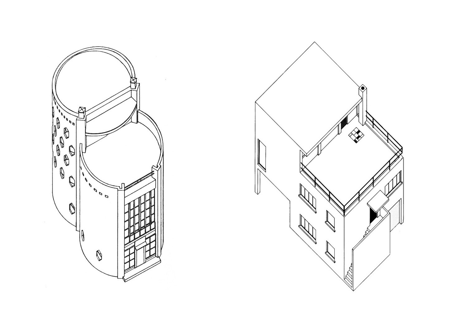
M.: I built a 1:5 scale model of Maison d’Artiste (Project by Theo van Doesburg & Cornelis van Eesteren) with a group of students in Delft. It was not possible to build this house back in 1920, but I think…, with today's technology we would manage to construct it on a 1:1 scale.
It would be great to move the 1:5 model to Paris, but the garden in front of the house seems a bit too small...Maybe on the square in front of Centre Pompidou.
Yes, it would fit well with the colored pipes.
M.: Can we go up to the roof-terrace?
Sure, but watch out while going up.
The metal stairs are quite fragile.
[While going up] M.: This interior-space-structure reminds me a lot of the Maison d’Artiste.
[While standing on the roof-terrace]
Did you know this was a detached house free-standing on a field? Now it is more a kind-of-semi-detached-house. It’s not so clear where the house begins or ends. The rural became suburb, the house is glued in between.
M.: This house is quite white and grey…
…We had a lot of trouble deciding the colors for the Maison d’Artiste. At one moment we even thought about keeping the 1:5 scale model completely white.
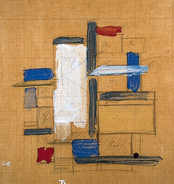
The documentation of the Maison d’Artiste is not definitive, not clear. Only a variety of color sketches of the 5 sides of the volume exist, but if you put them together… It doesn’t fit completely, and pictures of the actual model are all in black and white.
So, we decided to keep the surfaces…when we weren’t sure of the correct color, colorless.
M.: You also studied Architecture, right?
Yes, Architecture at the TU, Eindhoven...
I remember this joke my fellow students at the faculty were making...
?
Delft is about form; Eindhoven is about content.
[M. left the house immediately]
Case Study VDH; A blue wall or a red door
[New visitors incoming]
Advisor of the board: There was one artist staying here last year, he measured the complete house.
Wondering… [Did he measure the size of truth?]
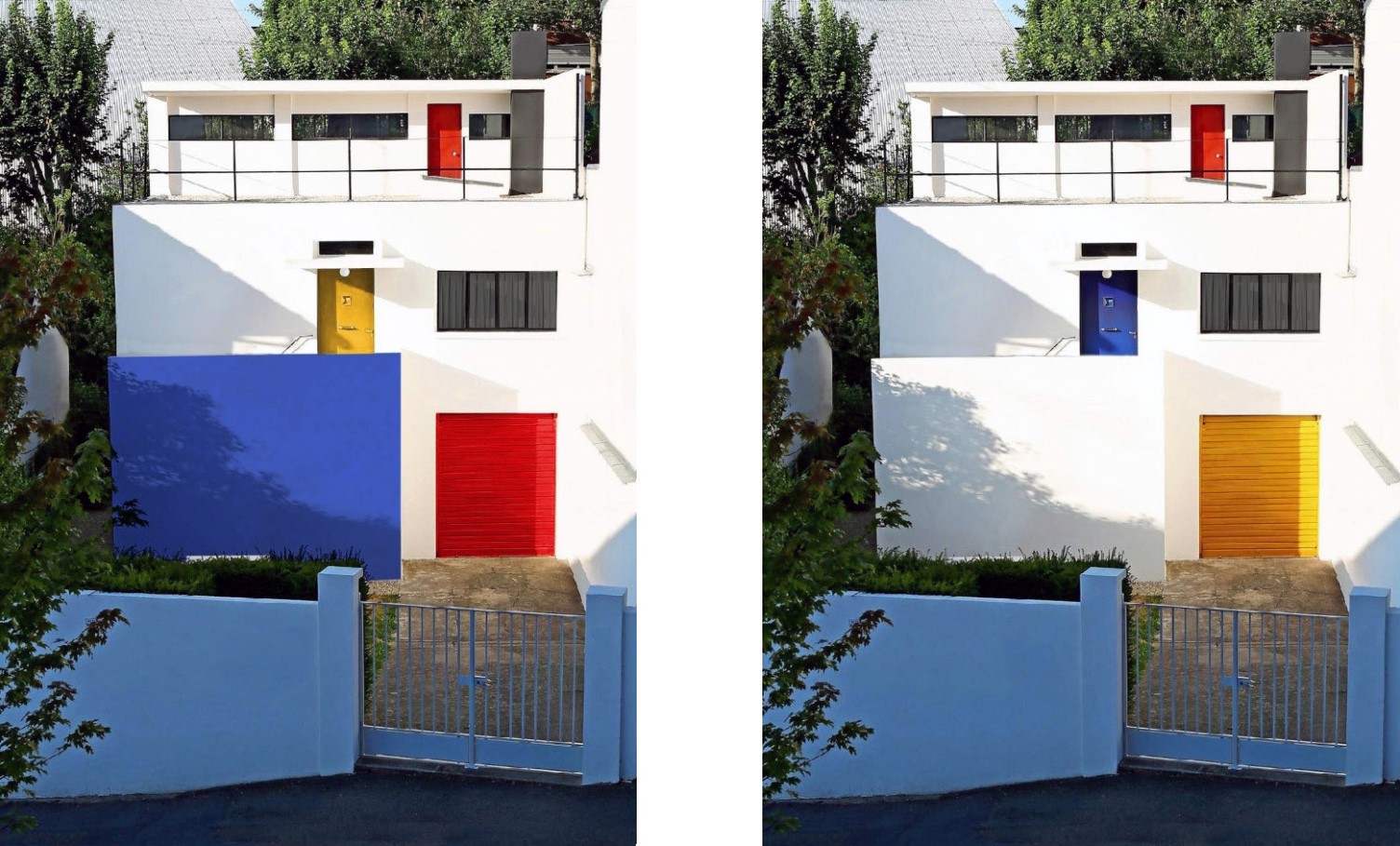
Director of a Museum: We were thinking of changing the colors of the house. There is this sketch in which the wall in front of the stairs is blue. Theo van Doesburg died just before he could paint the house.
His wife Nelly finished it. She painted it. Maybe it is not correct…
Nelly is also an artist, right?
Advisor 2: Yes, a musician, she played the piano.
Hmm…a painter who builds, a musician who paints.
Advisor 3: Where did I hear that before?
Some people presume the concrete block outside in the front garden was meant as a pedestal for a sculpture. A sculpture from his friend Jean Arp, who lived close by. A3 min walk from here.
…You don’t think this concrete block seems to be too perfect to be a pedestal? What did the artist find in the measurements?
Advisor 5: Well…He found out that all sides measure the same.
D = 0, Arithmetic
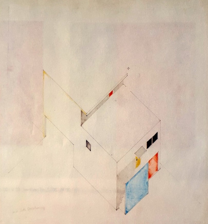
Director of a M.: Look here! His sketch says the color is not correct. It should be a kind of blue.
Advisor 1: Yes, we should do that! Paint it blue! Imagine seeing this intense blue surface when you enter.
Wait a moment…
Are you sure about the order of thought you are laying out here?
Director of a M.: What do you mean?
The dilemma…,
Director of a M.: What dilemma?
“Generalizations and abstractions are worthless unless they are tested by this concrete world.”— Will Durant, the philosophy of Plato.
I will explain it in the following research: about content in form, content in color.
Between projections [products of a theoretical education] and reality
Just before his death in 1931 and during the construction of his house, Theo van Doesburg laid out the foundation of Art Concrete (AC), a 6-point manifest. This was a next step in Theo van Doesburg's understanding understanding of abstraction, and the role of abstraction in art.
[Read more about Art Concrete in Tonight’s fight! Van Doesburg vs J.T.G.]
To understand the correct use of color (Should the wall be blue?) in the Van Doesburg House, we must ask ourselves the following question.
Q.: Is the Van Doesburg House still part of De Stijl? Or is it the beginning of a new era; the first and only architectural manifestation of Art Concret?
To answer this question, we must do a small exercise; we can better understand the role of projections in the creation of architecture.
Architecture is in a sense different from all the other arts because the outcome, the product, is not directly the act — the sculptor creating a sculpture, the painter painting a painting, a musician playing, the dancer dancing — but art-in-architecture is always a sum of various projections (sketches, technical drawings, collages, perspectives, writing, documentation).
When time passes by, often confusion occurs; we might consider one projection to be the true definitive form. (If you want to dive deeper into this idea I refer you to the Essay Abstract : Reality [Shadowplay])
In this light, the Van Doesburg House is an interesting example. Sketches, drawings, and pictures of models are not corresponding with the outcome, besides Van Doesburg himself died before finishing the building.
People who practice architecture themselves might know it is often the case in architectural projects, a misconnection between outcome and process-products. Sometimes you just must see it in reality to make the right decision.
A second important thing is the time of construction of the house. This coincides with a shift in Theo Doesburg’s artistic vocabulary; the playful, spatial effect of color in De Stijl made place for a more concentrated and concerned use of color in Art Concrete (AC).
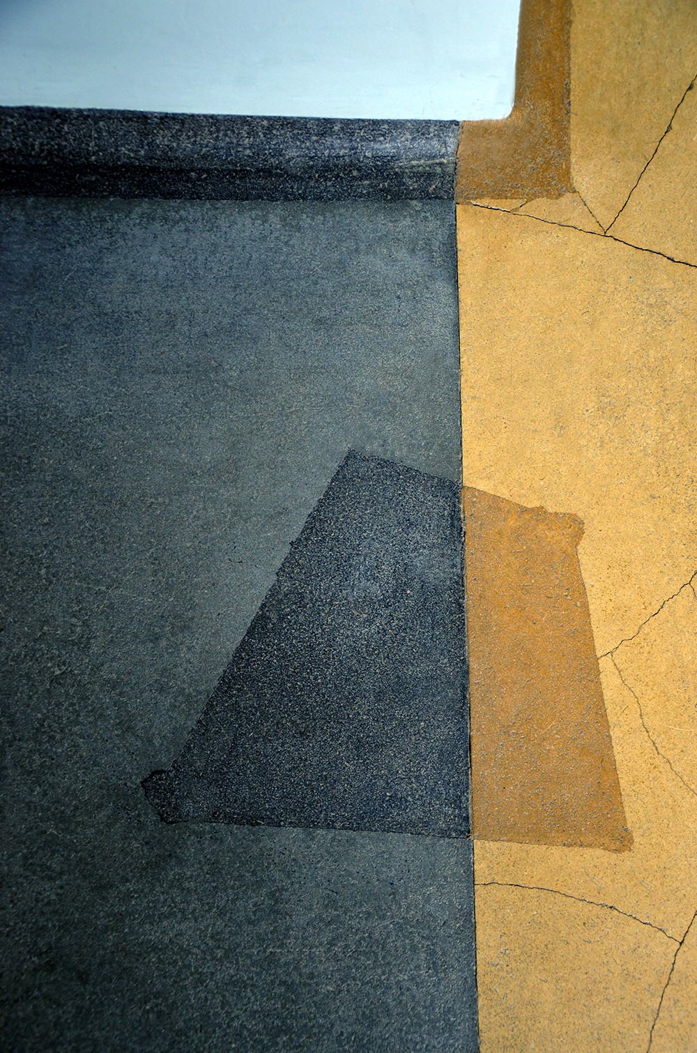
Exhibit #A About color
I made these two photo collages of the house.
[Left] The color division according to the 1929 sketch. What are planes? What are volumes? Lack of clarity, a confusion in the interpretation of planes and volumes in Architecture. Surface and color compete.
[Right] Since 1930. A clear vision on volumes and planes. The use of colors is controlled and silent. A color is translated as an abstract “Idea” of an entrance. Surface and color complement each other.
Exhibit #B About words
To place the house in relation to Van Doesburg's other artistic activities around the same time I present to you the following writing.
It has a controllable structure, a fixed surface without chance or individual inconstancy, unimaginative? Yes.
Emotionless? Yes.
But not without spirit, not universal-less.” (translation in English)
Het heeft “een controleerbare structuur, een vaste oppervlakte zonder toeval of individuele grilligheid, fantasieloos? Ja.
Gevoelloos? Ja.
Maar niet geestloos, niet universeel-loos.” (Dutch)
— A letter to his friend Antony Kok describing a painting in black, white and gray in January 1930, during the construction of the Van Doesburg House.
Exhibit #C About platonic shapes
“Our eyes are made to see forms in light; light and shade reveal these forms; cubes, cones, spheres, cylinders or pyramids are the great primary forms which light reveals to advantage; the image of these is distinct and tangible within us without ambiguity. It is for this reason that these are beautiful forms, the most beautiful forms. Everybody is agreed to that, the child, the savage and the metaphysician.” — Le Corbusier
Exhibit #D Ode to the cube
The primary elements of architecture language are not primary colors {confusion in architectonic language of De Stijl}, but primary volumes : {new clear understanding of architectonic language, establishing Art Concret}
Platonic shapes are used as an abstract Idea
Van Doesburg house = Art Concret, made manifest in architectural language. Constantly reminding us of our recollection of the perfect form of the cube and the square.

Colors are used as an abstract Idea
Its external white appears clear and vivid in the daily play of sunlight. Colors are reduced and securely placed, not to achieve a sensual effect {architectural endeavours of De Stijl}, but ideally used abstract; markings openings, signaling routes.
Internally colors are used to indicate key domestic rituals; closing curtains (color), indicating a place for clothes (color), a table to study on (color), a table to eat on (color). Less intense tints are used as a painted surface in the flooring of the domestic rooms. Reddish {earthly} colors come back in the bathroom & kitchen flooring.
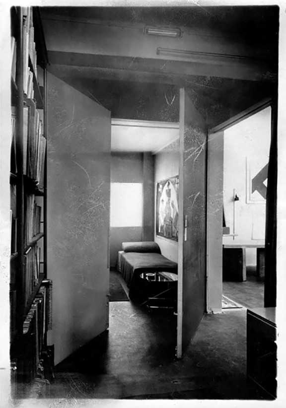
The atelier is a colorless space for practicing art {spiritual contemplation} and left in solemn white and grey, leading our eyes {between the blue curtains} towards the pure colors of nature behind its window surface.
Memory is used as an abstract Idea
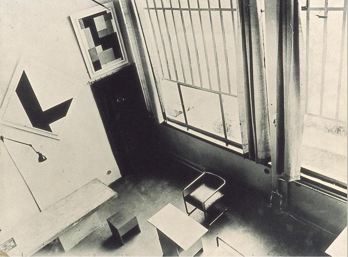
The scale, dimension and openings of the atelier recalls a collective collection of memories from church [temple]. A balcony (hovering platform in upper corner), its timeless altar (concrete table as a centerpiece) and the linear window divisions (as leaded windows but interpreted abstractly. Only a linear composition remains; the colors are not anymore in stained glass, but they are projections of the nature behind).
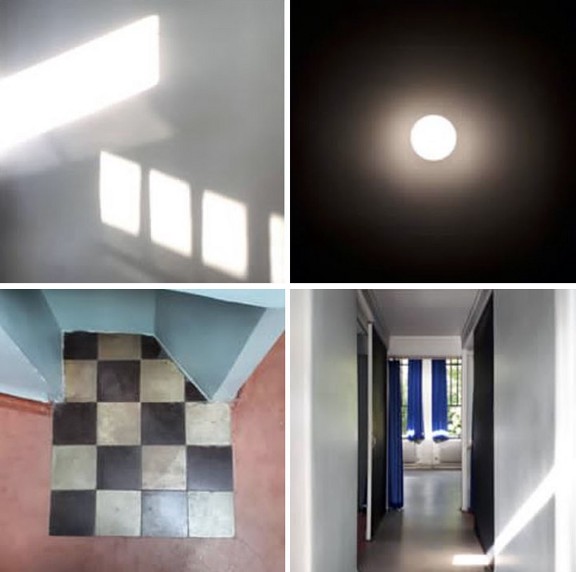
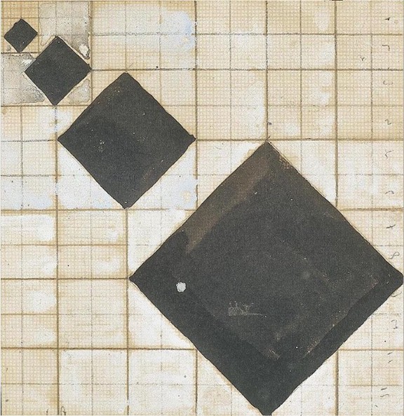
A slightly rotated checkerboard in the corner of the library; reminding us that van Doesburg played a game in finding the true spirit of abstraction; not to be found in books, nor in the cosy feeling of sitting around fire.
So, was de Stijl nothing more than a mere shadow in Plato’s allegory of the cave?
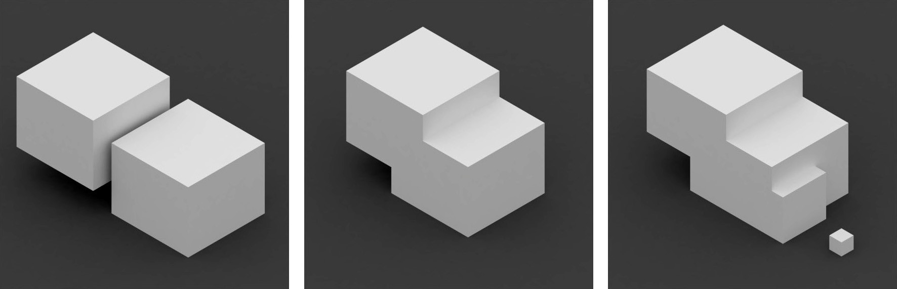
No, it was the guide leading towards the exit. Vandoesburg`s Pyramid [Ideal Idea of Abstraction] took shape in two modulated shifting cubes facing a perfect third cube; the pedestal becomes sculpture, an ode to the highest order, the cube itself.
Answer:
D̶e̶ ̶S̶t̶i̶j̶l̶>>> Art Concret
In 1912 ground-breaking writings: Concerning the spiritual in art, Kandinsky pointed out the relationship between music, color and emotions in painting. In a sense Van Doesburg extended this notion by introducing the use of color in architecture, inventing the practice of “the colorist.”
Van Doesburg matured in his use of colors; from a sensual painterly [color as emotion] approach, during the Stijl.
-
Represented in Maison d’Artiste. {filled with colors}
Developing in a spiritual spatial [color as meaning] approach, in his last years, while formulating Art Concret.
- Represented in Maison Van Doesburg. {colors are reduced and precisely placed}
Unfortunately, with Theo’s early death, “the colorist” was a short-lived profession.
“Color in architecture began and ended with De Stijl…Within De Stijl, van Doesburg was by far the most interested in color in architecture.”
— Donald Judd, Essay: Some Aspects of Color in General and Red and Black in Particular, 1933
Nowadays we consider color a secondary aspect in the practise of architecture, and in many cases as a mere tool for decoration [following Adolf Loos approach in Ornament & Crime]. There are just a few architecture schools who give courses in color-theory, most schools will not mention it at all. Some key figures state that color should be true to material, material defines color.
Nonetheless, color is the first thing we notice when we open our eyes. I would go this far to state: Color is the primary matter in architecture, as it is pure light. If geometry is language, colors are the words.
Van Doesburg House; Spiritual use of color in Architecture. © M. Production Published 03.2020 Triple-A Society