Uniformity in Contemporary Design
Somewhere in the year 1998 I created my first website, a website about Star Wars video games. It had some images, a bit of text, an animated GIF of an exploding Death Star, and even MIDI music playing in the background.
It was a funky, but horrible looking website. But nevertheless, I was so happy with it. I created this thing with my basic, self-taught html skills, reaching people all around the world. A friend at school also built a website. It was a green looking website, that’s what I remember, but it didn’t look much better than my website though. All the web was a hideous, fun, self-made playground, without cookies.
Graphic design for web design didn’t exist in those days. 99% of the content and design was amateur work.
Fast forward 20 years
Some weeks ago, I was sitting in a cafe @ a corner in Warsaw, with two old friends. I asked a friend how it was going with his sister. She still lives in Berlin, and changed some jobs in the last years, however she remained a graphic designer, he told me.
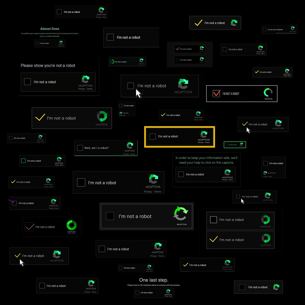
What she does…, well I still don’t understand. If I would say she is a graphic designer, she would get quite mad… She is like what you call it, a …team, project, lead, manager, something. She designs buttons for websites.
Yes, I know it’s more than that, and it’s not so easy to design a good button. One day when I was visiting her, I asked what she did that day at work. She took her cell phone and typed in the name of a website. Today we worked on this, she said. In the corner of the screen there was a tiny thing, two black lines forming a cross, you could press it to exit the site.

I know, she earns good money with this stuff, but when I think back about the work, she created at the Academy of Art…I mean that was really something.
She is not the only one, there are highly skilled graphic designers working for big, medium, and small enterprises all over the world. They are all occupied with…, let’s call it surface-aesthetics, of pages, apps and more. They make slightly altered tweaks of the previous versions. Compare it to the task of designing a new model Porsche 911 or VW Golf.
There is a Set-design with specific characteristics, these characteristics form a restricted box in which one ought to think and design. Polishing lines, bending curves 0.5° more, exchanging materials of the interior. Wood instead of plastics this year, metal instead of wood that year, the fonts more curvy, straighter, the size of the title 0.2 Pt smaller, the color-scheme a bit more saturated. All in a way that it still resembles the old, but in a new way of course. Too much change could upset the customer ~ user. They might think about not buying or using the product anymore
Corporate Design
There is this series on Netflix called Abstract: The Art of Design, describing the working process of a variety of successful creative people. One episode is about Instagram and the acquisition of Instagram by Facebook.
The new owners wanted an update, a makeover, a clearer attractive look of the app. They spent a couple of millions on an experienced design-team to tweak the logo and to do some surface-aesthetics. The design-team had to update the app to a contemporary appealing version, by taking the essential elements of the old and reconfigure it in a clean, crisp, and simple way.
Nowadays teams of thousands of highly skilled professionals are busy with just that. Deciding the size of squares, make small adjustments of the color-schemes, move titles a bit to the left, up or down, year, after year. It was painful to see to see the most original idea for the make-over, to create a less confined, free interface was being regarded as silly and tossed away immediately.
Each year there should be change, even if it’s not necessary, but always fitting in the precisely laid out boundaries. Change is good if it looks like nothing has changed.
Concentrate and dictate
Personal websites and blogs are mostly a thing of the past, although nowadays it has become much easier to create a personal website. But even if you take the effort to build a personal site, who in the world would visit it. None of the algorithms will lead you there.
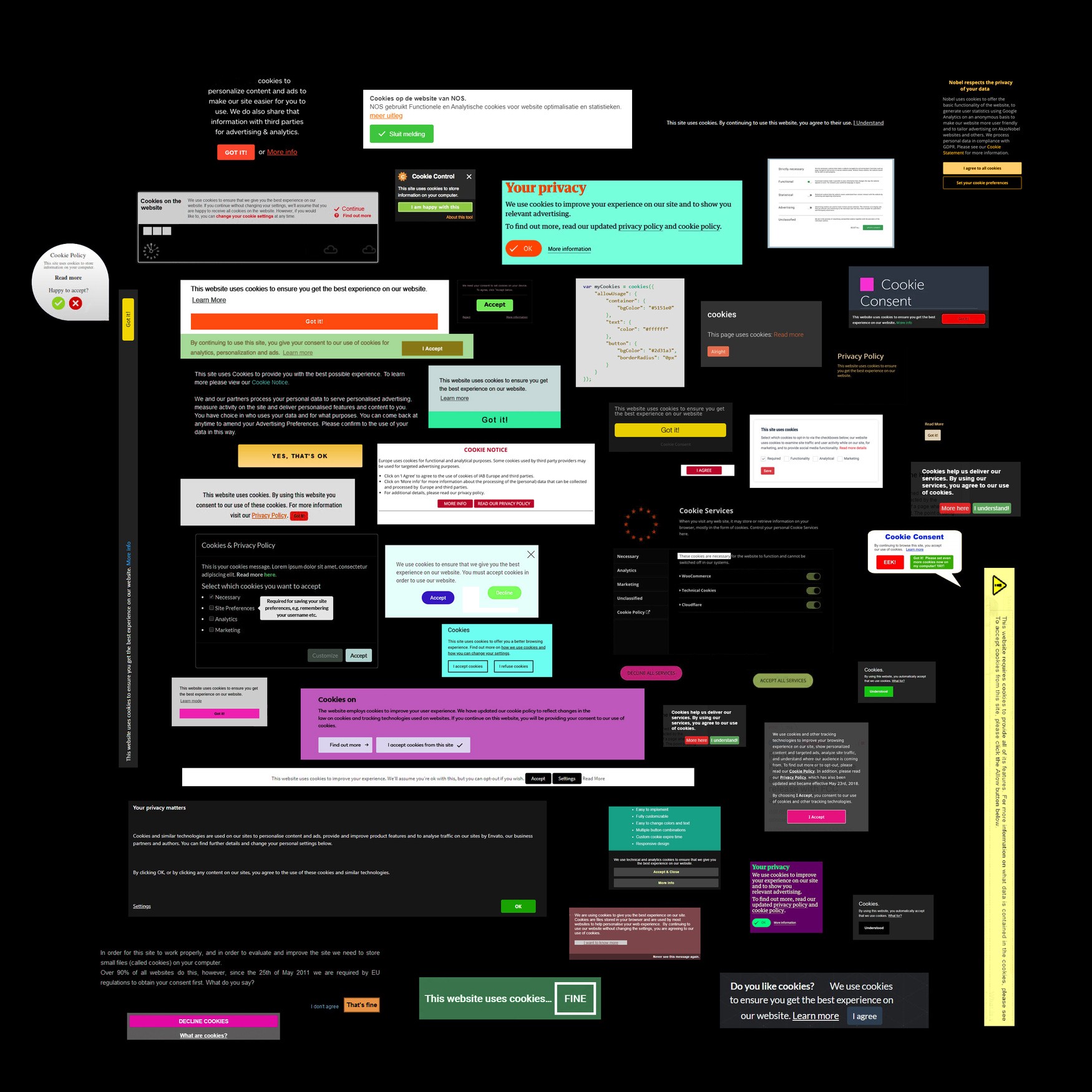
“Paywalls or bombed with advertisements, that’s the recent future of internet”
Most information is concentrated in a handful of domains controlled by a few companies. At the core of all these companies stands uniformity.
Everyone the same layout, the grey background, the same aesthetics, the same fonts, the same box.
We now have thousands of highly skilled designers, working on exactly this; uniformity as a key-tool in design-aesthetics. Nothing funky, nothing trashy, nothing playful. Conform the existing norms and make it stupid simple. I personally have nothing against simple if it doesn’t become stupid. I prefer super simple instead.
What is left for the user? You can color the squares,
& put your face in a circle.
Recently some nondualist Chinese found a way to get rid of all that. They put the circle in the square.
Uniformication: The App
Do you want to change the background, the shape and overall design of your page? Sure, why not, if it looks the same as all the other users.
Do you want to post stories or videos? You can do it on all platforms,
Do you want to chat? You can do it on all platforms.
Do you want to send your private data to someone else? We are happy to provide the option on all our platforms. We encourage you to send your data.
You clicked NO to grant us access to all your data. Sorry to inform you, you cannot use our services anymore. Click YES and you can.
No, you cannot grant us access to just one picture, we also need access to the other nineteen eighty-four…, and your contacts. And your messages, and your location. You want to call? Click YES to give us access to your microphone.
Back to The Design
Now even though these different products start to look the same, I see the only one logical step soon is to merge them all into one. We can just call it: The App.

Reminds me of these cars. We now have the SUV Volvo, SUV VW , SUV Porsche, SUV Maserati, SUV Peugeot, SUV Seat, SUV Mazda, SUV…We can call them all: The SUV.
Nobody would dare to design and release a Fiat Multipla these days.
Ok it seriously was ugly as f…, but I will never forget that design. Yeah, the Tesla Monster with broken windows comes close.
Back to The Cafe
Anyways, this friend, after clicking on the cross, showed me pictures of a city-trip he made. One snapshot showed him standing in front of a giant logo. The city? One of those cities.
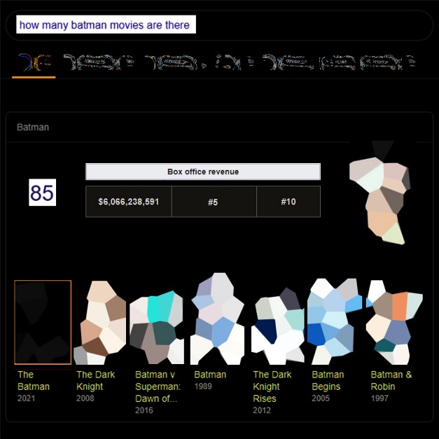
Have you heard about this new upcoming Batman Movie? They are making another one?
Yes, it’s a bit different this time. I heard they called it: The Batman. The plot is unknown. I wonder who plays Joker this time.
Uniformity in Contemporary Design [About Malevich] © M. Production Published 02.2020 Triple-A Society